
Data Hub: Data Onboarding
What this page is for
A connector brings in readings. Data Onboarding tells you whether the context around those readings has been filled in — capacity, location, expected production, financial terms, warranty dates.
That distinction is the whole point of the page. A site with readings but no expected production will show you kilowatt-hours, but the platform cannot tell you whether that figure is good or bad, cannot compute a performance ratio, and cannot raise a meaningful underperformance alert. The data is there; the judgement is not.
So this page is the honest answer to "why does this site have no performance figures?" It is almost always a missing field rather than a missing reading.
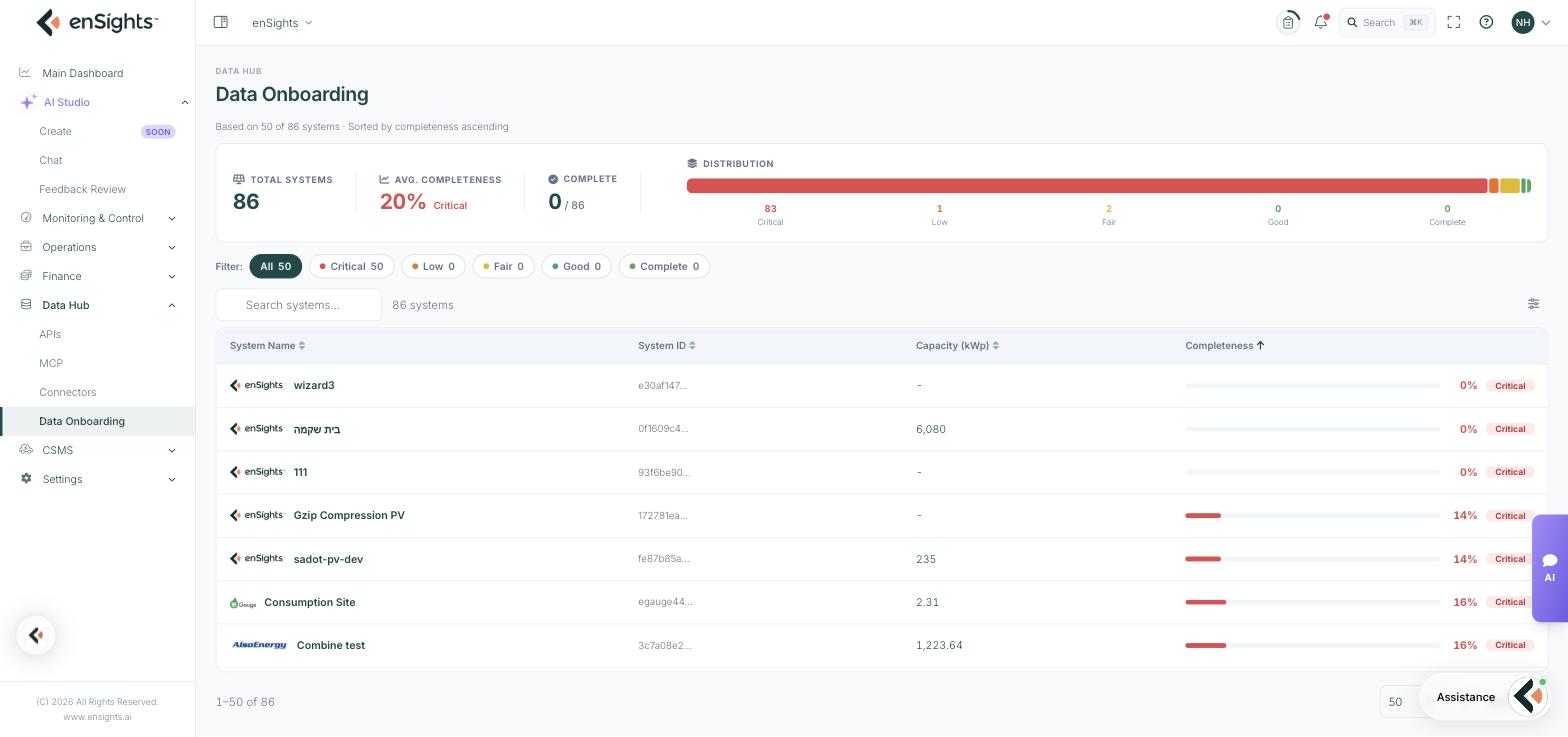
The summary row
Figure | Meaning |
|---|---|
Total Systems | How many systems exist in the account. |
Avg. Completeness | The average score across them, with its band label — for example 20%, Critical. |
Complete | How many systems are fully complete, out of the total. |
Distribution | A stacked bar with counts in each band: Critical, Low, Fair, Good and Complete. |
A note under the heading says how many systems the figures are based on and how they are sorted — least complete first by default, which is the order you actually want to work in.
The bands
Five bands, from Critical through Low, Fair and Good to Complete. The filter chips above the table carry a count each, so you can jump straight to a band — clicking Critical narrows the list to the systems most worth fixing.
The table
Column | Meaning |
|---|---|
System Name | The system, shown with its vendor logo. |
System ID | The internal identifier, truncated. |
Capacity (kWp) | Installed capacity, or a dash where it has not been entered. A dash here is itself a completeness problem — capacity underpins most normalized metrics. |
Completeness | A progress bar, the percentage, and the band label. |
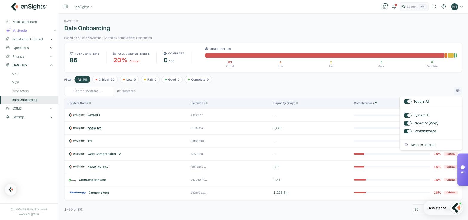
Above the table: a search box and the system count. The preferences button at the right lets you toggle the System ID, Capacity and Completeness columns, with Toggle All and Reset to defaults.
The per-system view
Clicking a row opens that system's edit page with an Onboarding completeness banner at the top — for example "8 of 79 scorable fields complete" — and a percentage for each tab down the left: General, Advanced, Performance, Integrations, Financials, Alerts Management, Products & Warranties, Inventory, Obligations.
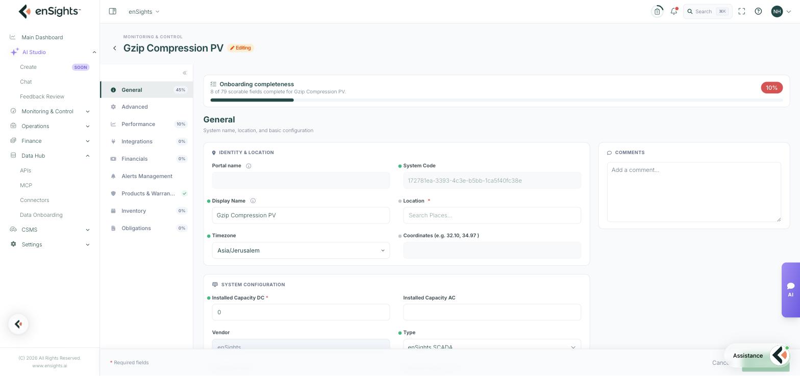
Inside a tab, each scorable field carries a small marker: filled where the field is complete, hollow where it is included in the score but still missing. Hovering tells you which. This is what turns a percentage into a to-do list — you can see exactly which fields are pulling the score down rather than guessing.
The tab percentages tell you where the effort is best spent. A system at 45% on General but 0% on Performance will never produce a performance ratio, however much else is filled in.
How to improve a system’s score
- Go to Data Hub → Data Onboarding. The least complete systems are already at the top.
- Click the system with the lowest score, or the one you care about most.
- Look at the per-tab percentages and start with the tab that blocks what you need — Performance for expected production, Financials for revenue figures, General for capacity and location.
- Fill in the fields marked as missing.
- Press Save. The score recalculates.
Which fields matter most
Not every field carries the same weight in practice, whatever it contributes to the percentage:
- Installed Capacity DC — without it, nothing can be normalized. Almost every comparison across sites depends on it.
- Location and coordinates — needed for weather data, and therefore for anything weather-adjusted.
- Expected Production and Expected Irradiance (the Performance tab) — the twelve monthly pairs behind Expected Weather Adjusted Power. Without them there is no expectation to compare against.
- Timezone — gets daily boundaries right. Wrong timezone quietly shifts every daily figure.
- Financial fields — needed before revenue appears anywhere.
Notes
- Completeness is about configuration, not data quality. A system can score 100% and still have a broken sensor.
- A low fleet average is normal on an account that has grown quickly. Work down the Critical band rather than trying to reach 100% everywhere.
- Fix onboarding before investigating a performance anomaly on that site. Half of anomalies on incomplete systems are the missing field, not the asset.
- The page is titled Onboarding Completeness in the browser tab, and appears as Onboarding Completeness in the tenant feature list.