
PV site: the Analysis tab
Fleet Management → PV Sites → a system → Analysis
What this tab is for
Analysis is where a suspicion becomes a diagnosis. The fleet list tells you a site is down 20%; Analysis tells you whether that was the whole site or one inverter, all day or only in the afternoon, and whether the weather explains it.
The header numbers
Two tiles sit above the chart and follow the period control:
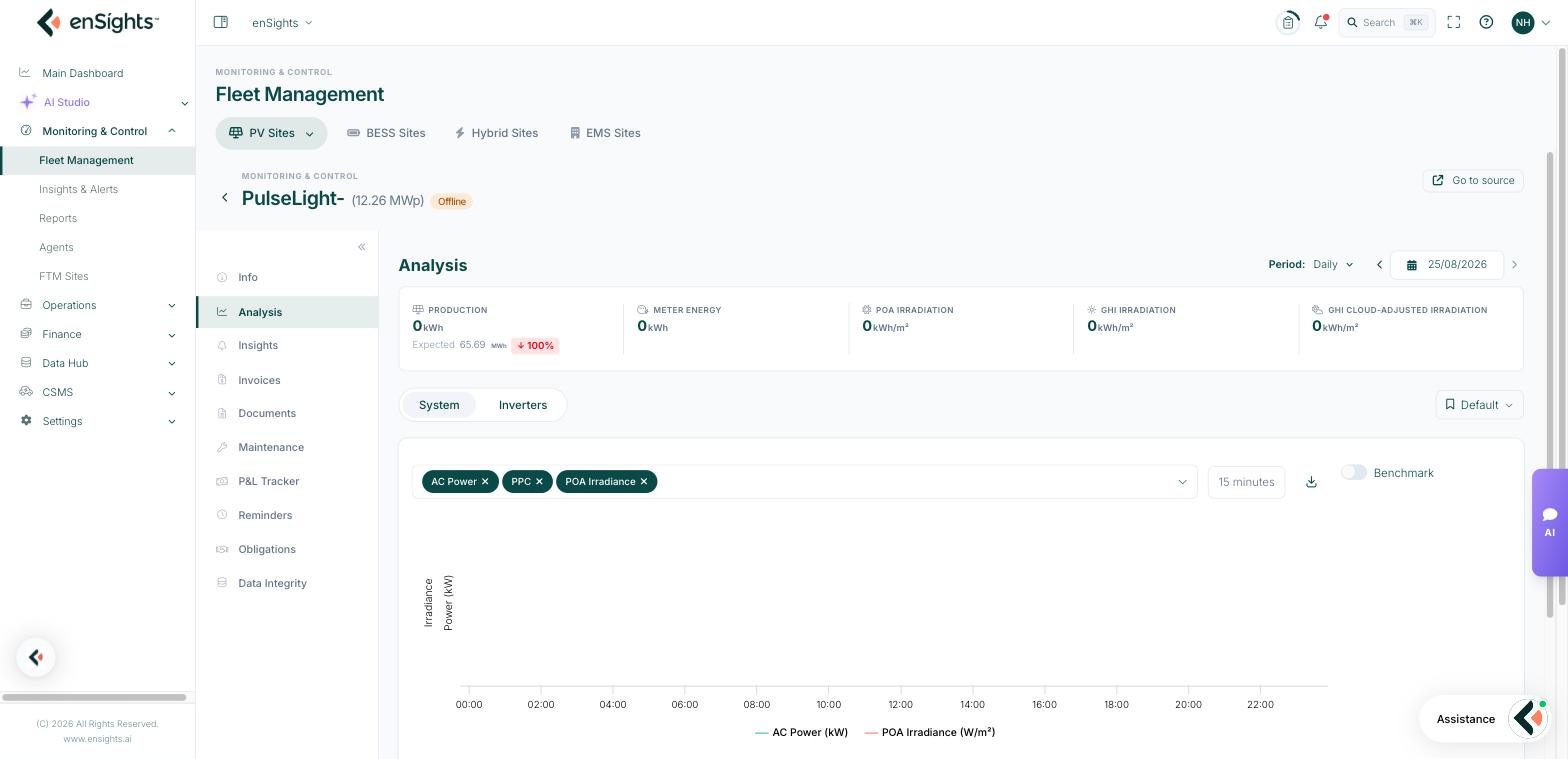
- Production — energy for the period, with Expected underneath and the percentage difference. This is the same comparison the fleet list shows as Actual vs. Expected.
- Meter Energy — the revenue-grade meter reading for the same period, where a meter exists. A persistent gap between Production and Meter Energy is a metering or configuration issue, not a performance one.
System or Inverters
The System / Inverters toggle changes what the chart plots. System shows the site as one series; Inverters plots one series per inverter, which is how you tell "the site is down" from "one inverter is down".
Below the chart, the inverter table lists every inverter with AC Capacity, Periodic Production, Normalized, vs Avg, kWh vs Avg, Last AC Power and Max Power. Normalized and vs Avg are the useful columns: they compare inverters on equal terms, so a small inverter is not automatically the worst performer.
Choosing what to plot
The chip field above the chart is a multi-select of metrics — AC Power, PPC, irradiance, meter power and the rest of what the site reports. Add as many as make sense on one axis, remove one with its ✕. The granularity selector next to it (for example 15 minutes) controls the resolution: fine granularity shows shape — clipping plateaus, restarts, curtailment steps — while coarse granularity is easier to read across a long period.
The download icon exports exactly what is plotted, at the chosen granularity, which is the quickest route to a spreadsheet for a customer.
Benchmark
The Benchmark toggle adds a comparison against other sites, so you can see whether a dip is local to this site or shared with its neighbours — the fastest way to separate a site fault from a regional weather or grid event.
Saved chart views
The bookmark control (labelled Default until you change it) saves a metric combination and granularity so you do not have to rebuild your favourite chart every time. Teams usually keep one for daily checks and one for fault-finding.
Common tasks
Is it the site or one inverter? Switch to Inverters and sort the table by Normalized. One low value is an inverter problem; all low is a site problem.
Did the weather cause it? Plot AC Power together with irradiance. If both fell together it was the weather. If irradiance held and power fell, it was not.
Is the inverter clipping? Set granularity to 15 minutes and look for a flat top at the AC limit around midday.
Prove a case to a customer. Build the chart, then use the download icon and attach the CSV — the numbers behind the picture, at full resolution.
Common questions
The chart is empty but the site shows production.
Check the period and the granularity. Very fine granularity over a long period, or a period before the site was commissioned, both draw nothing.
Inverter production does not add up to system production.
They are separate measurements. The site's production source may be the meter rather than the inverters, and a missing inverter shows as a gap in the sum.
Why is the expected figure missing?
Expected values need the monthly production plan in System Settings → Performance. Without it there is nothing to compare against.