
Finance: Business Performance
The Business Performance dashboard answers one question for the whole portfolio: are we earning what we planned to earn this period, and if not, how much of the gap is weather and how much is ours to fix? It is the page a finance lead, asset manager or executive opens first in the month, and the one you share with the board.
Everything on the page is priced in money, not kWh. Energy is converted to dollars using each system's contracted tariff and tiers from Financial Settings, so a system with no tariff adds nothing to the figures (the page tells you how many are in that state).
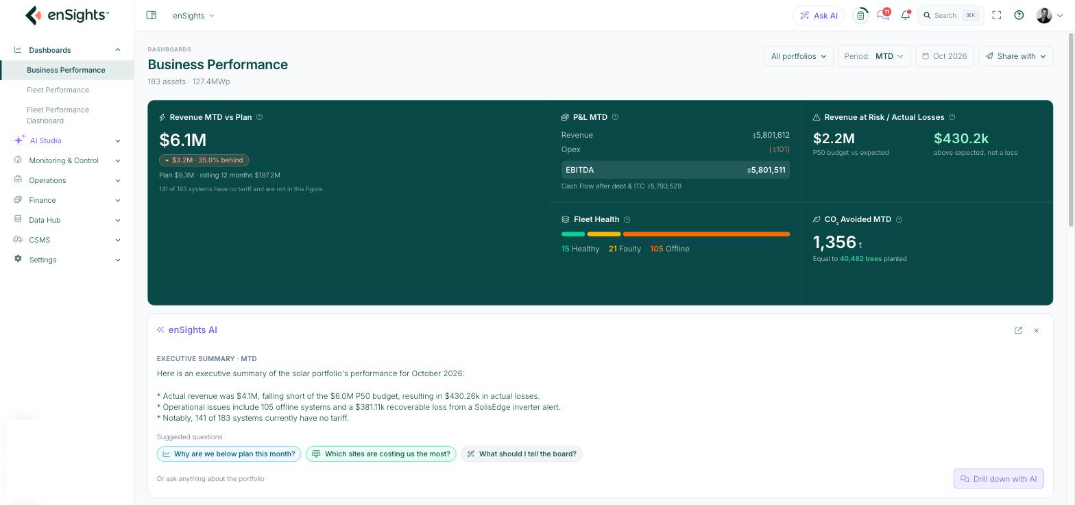
Choose what you are looking at
The three controls at the top right set the scope for every number and chart on the page.
Control | What it does |
|---|---|
All portfolios | Picks which assets are in scope. The dropdown has four tabs: All (every asset in the account), Sites , Groups and Customers . Tick one or more entries, then click Apply . The footer of the dropdown shows how many assets and how many MWp your selection covers. Reset returns to all assets. |
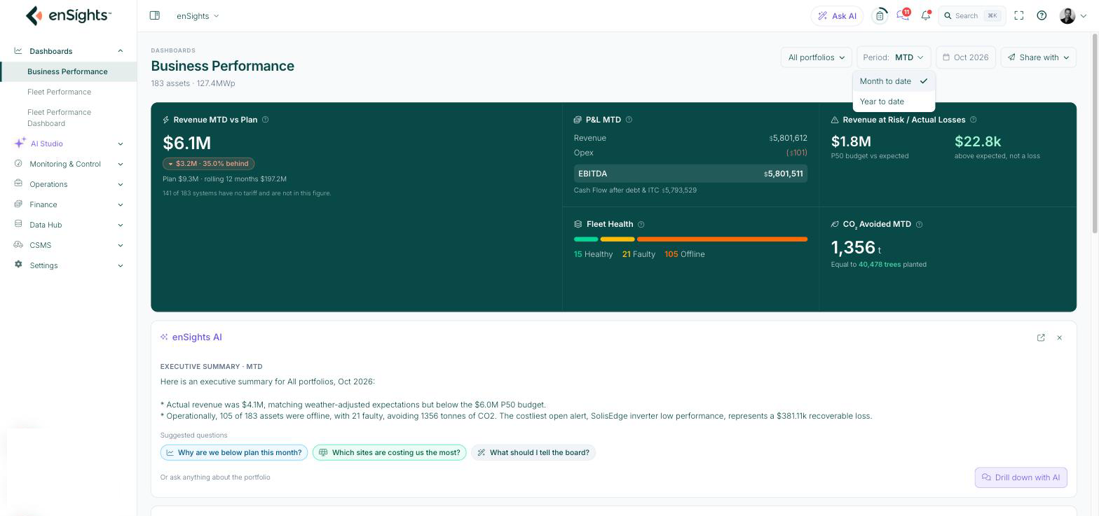
Period | Month to date (MTD) or Year to date (YTD). Every KPI label changes to match, for example Revenue MTD vs Plan becomes Revenue YTD vs Plan , and the AI summary is regenerated for the new period. |
Oct 2026 (date chip) | Shows the date range the page currently covers. In MTD it is the current month; in YTD it reads as a range such as Jan - Oct 2026 . It is a label, not a picker: the page always runs to today. |
Share with | Sends a snapshot of this dashboard to colleagues. See Share the dashboard below. |
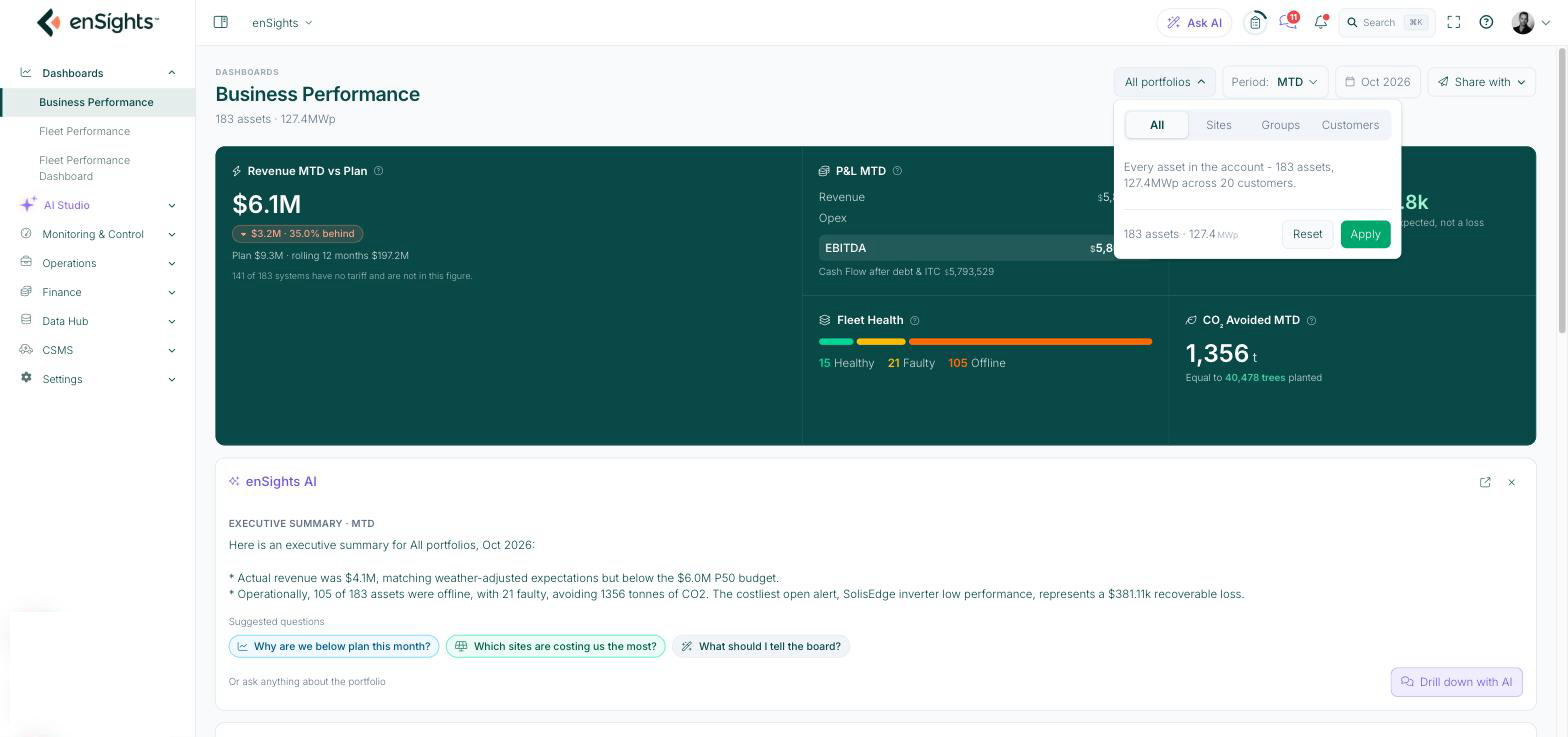
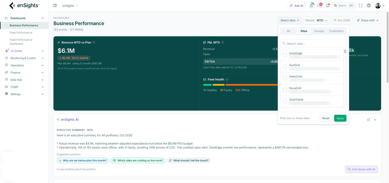
The Sites, Groups and Customers tabs each have a search box, and each row shows the size of what you are selecting (kWp for a site, assets and MWp for a group or customer).
The KPI band
Five tiles across the top summarise the period. Hover the small ? next to each title to see its definition in the portal; the same definitions are below.
KPI | What it means |
|---|---|
Revenue MTD vs Plan | Actual revenue is metered export × the contracted tariff and tier for each asset, summed across the assets in scope. Plan is the P50 budget for the same days, taken from Financial Settings. The coloured pill is the variance (actual − plan) in money and percent. The small print below gives the plan figure, the rolling 12-month revenue, and how many systems have no tariff and are therefore not in this figure. |
P&L MTD | A four-line income statement for the period. Revenue is billed plus accrued revenue. Opex is O&M, land lease, insurance and asset management booked to the period. EBITDA is Revenue − Opex. Cash Flow after debt & ITC then subtracts debt service and adds ITC proceeds. Costs appear in brackets, for example ($101) . |
Revenue at Risk / Actual Losses | Two numbers. Revenue at Risk is P50 budget − weather-adjusted expected: the gap caused by irradiance rather than operations, so it is not controllable. Actual Losses is weather-adjusted expected − actual, covering downtime, clipping and O&M passed SLA; this is the part operations can act on. Both are priced at each site's contracted tariff. When actual is above expected the second figure turns green and reads "above expected, not a loss". |
Fleet Health | A bar and counts of systems by status right now. Healthy : producing within expected. Sleeping : outside generation hours. Faulty : an open fault or output below expected. Offline : no data past the site timeout. No Generation : online but zero output in generation hours. Only statuses with at least one system are listed. |
CO₂ Avoided MTD | Period production multiplied by a single global grid emission factor (not a per-market one), with an equivalent in trees planted that uses the same factor set as the rest of the portal. |
enSights AI executive summary
Below the KPI band, enSights AI writes a short executive summary for the current scope and period: where revenue landed against budget, what the operational picture is, and the single costliest open alert. Three suggested questions sit underneath, for example Why are we below plan this month? and What should I tell the board?. Click one, or Drill down with AI, to continue the conversation in Ask AI with this dashboard as context. The summary regenerates whenever you change the portfolio or period, and you can close the panel with the ×.
Revenue vs Plan chart
A rolling 12-month view of money earned against money planned. Each bar is metered export priced at the system's rate; the line is its P50 budget priced the same way. The current month is partial and drawn dashed.
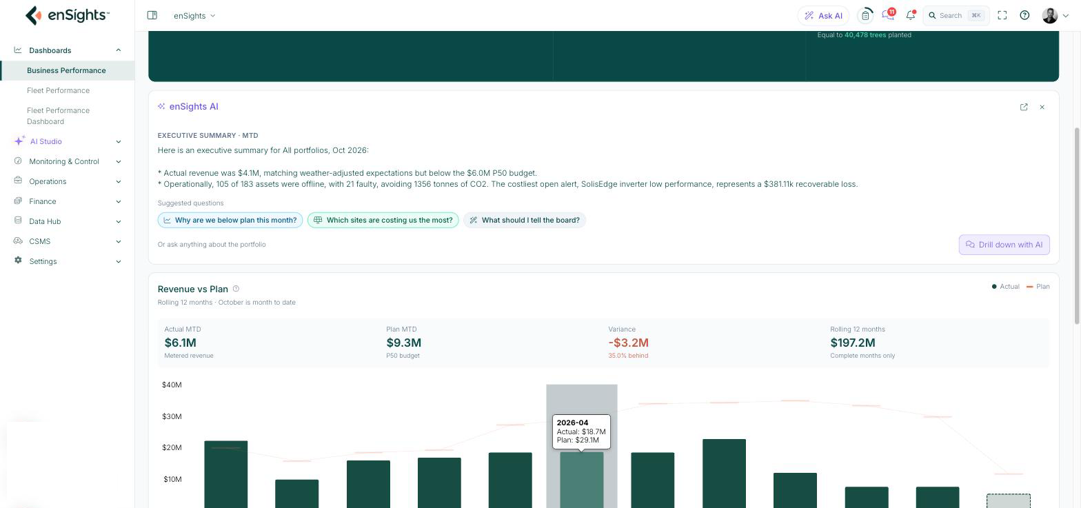
- Actual MTD, Plan MTD and Variance above the chart repeat the headline KPI for the current period. Rolling 12 months sums complete months only, so the dashed current month is excluded.
- Hover any bar to read that month's actual and plan.
- Pricing rule. A flat-tariff system uses its tariff. An asset-managed system uses a single rate blended across the whole window shown, so its months move with production rather than with what was booked that month.
- Systems with no tariff and no asset-management income add energy but no money. The footnote under the chart tells you how many are in that state.
Revenue at Risk · Budget to Actual chart
A waterfall that walks from the P50 budget to metered actual, splitting the gap into weather and named operational losses. The axis does not start at zero so the small loss steps stay readable next to the budget bar. The legend colours are Benchmark (dark green), Weather variance (light grey), Operational loss (orange) and Unexplained (slate).
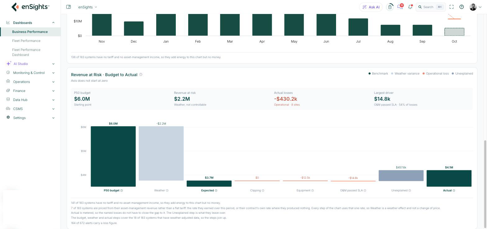
The four figures above the chart are the story in one line: starting budget, the weather gap (not controllable), the operational losses (with how many sites they come from), and the largest single driver with its share of losses.
Step | Definition |
|---|---|
P50 budget | Budgeted production at P50, priced with the tariff and tiers set in Financial Settings. The starting point. |
Weather | The difference between budget and what the actual irradiance allowed. Not an operational loss. |
Expected | Weather-adjusted expected revenue: what the portfolio should have earned under this period's real weather. |
Clipping | Energy lost when DC production exceeds the inverter's AC rating or the site's export limit. |
Equipment | All losses from alerts, excluding PPC alerts, that are still within the O&M SLA response window. |
O&M passed SLA | Losses from alerts that stayed open after the O&M contract's SLA response time expired. These are the losses to raise with your O&M provider. |
Unexplained | What the named loss buckets do not account for. Actual is metered, so the buckets are not guaranteed to close the gap to it; whatever is left over lands here, and it can be positive. |
Actual | Metered export × contracted tariff for the period. |
Read the footnotes under the chart before quoting a number. They state how many systems have no tariff, how many are priced from asset-management revenue rather than a flat tariff, how many have weather-adjusted data (only those feed the budget, weather and expected steps), and how many open alerts carry a loss figure.
Share the dashboard
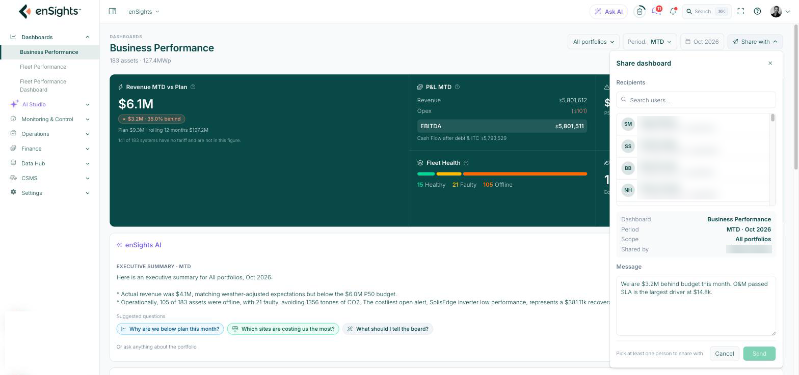
Share with sends a snapshot of what you are looking at to other enSights users, with a note.
- Set the portfolio and period first. The share captures the current scope, and the dialog lists it under Dashboard, Period, Scope and Shared by so you can check before sending.
- Click Share with and tick one or more Recipients. Use the search box to find a user by name.
- The Message is pre-filled with a one-line summary of the period (for example the variance to budget and the largest driver). Edit it or leave it.
- Click Send. The button stays disabled until at least one recipient is selected.
How to
- Explain a bad month to an owner. Read the Revenue at Risk / Actual Losses tile first. If most of the gap is Revenue at Risk, it was the weather; say so and move on. If Actual Losses is large, open the waterfall and quote the Largest driver.
- Find what to chase with O&M. Look at the O&M passed SLA step. Those losses happened after the contractor's response time expired, so they are the ones to raise at the next O&M review.
- Check one customer or group. Open All portfolios, switch to the Customers or Groups tab, tick the entry and Apply. Every tile, the AI summary and both charts re-run for that selection.
- Prepare a board update. Switch Period to Year to date, click What should I tell the board? under the AI summary, then Share with to send the snapshot and note to the people who need it.
Notes
- Zero money is not zero energy. A system without a tariff in Financial Settings still produces and still appears in Fleet Health and CO₂, but contributes nothing to revenue, plan or the waterfall. Add the tariff in Finance → Financial Settings to bring it in.
- The waterfall only balances for weather-adjusted systems. Budget, Weather and Expected cover systems with weather-adjusted data; Actual covers everything metered. The Unexplained step absorbs the difference, so a large Unexplained value often means missing weather data rather than a hidden fault.
- Loss figures come from alerts. Clipping, Equipment and O&M passed SLA are built from alerts that carry a loss value. An alert without a loss figure does not show up here even if the site was down.
- Switching period takes a few seconds. The revenue tiles show a loading placeholder and Share with is greyed out until the YTD or MTD figures finish calculating.